Advertising On Avier.Info
Web adverts sizes and layouts
On this page you will see three examples of the advertising availble on Avier.Info throughout the pages and blogs. Leaderboard Banner is shown at the bottom of the page. Medium Rectangle is shown on the righ hand side sidebar and Wide Skyscraper is also shown on the right hand side sidebar.
We Are Aviation
There are a lot of excellent aviation websites and services, many of which we promote and link to by blogs images and advertising
We are News , Information and Services, which mean we curate collect and display all top tier news and services in one place.
Digital Marketing
If you want to reach the Aviation industry through adverts social media and SEO then please contact us.
SEO is a specialist area we can produce a plan to get your specialist service in MRO , jet finance or avionics to a target market
We stop at nothing
We just keep going
We Love To Explore
We look at anything and everything
We Take It Step-By-Step
We research everything
We Keep It Simple
Life’s too short to be complicated
Our Mission.
We Believe In Hard Work And Dedication
Once we have a project we never give in until it is completed, we work internationally in different countries at in different time zones
Display Advert Sizes
Leader Board 728 x 90
Leaderboard Banner (728×90)
The 728×90 Leaderboard is part of the IAB standard banner sizes, and works well on the Google Display Network.
What does a 728×90 banner look like?
On a desktop browser the ad is displayed like this:
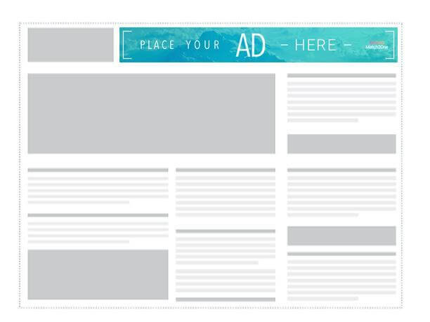
Also known as a Horizontal Banner, this is the 2nd most common ad size among global inventory, with 25% of global impressions. This banner combined with the Medium Rectangle and the Mobile Leaderboard should cover most of your Display Advertising needs.
The 728×90 Leaderboard is part of the IAB standard banner sizes, and works well on the Google Display Network.
Where is the Leaderboard Banner used?
The horizontal banner is usually displayed at the very top of websites – but sometimes also shows up at the bottom.
“Above the fold” ads tend to deliver better than banners at the bottom of a page – simply because fewer users scroll all the way to the bottom of a website, and when they get there they may feel like they are already done with the content and are less likely to click on to something else.
Example of a Leaderboard ad
Below is an example of a well designed Leaderboard Banner:

Medium Rectangle 300 x 250
Medium Rectangle Ad (300×250)
What does the 300×250 Medium Rectangle Ad look like?
On a desktop setting the Medium Rectangle looks like this:
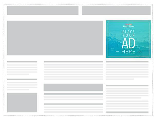
Where is the Medium Rectangle used?
No Display Ad campaign is complete without the Medium Rectangle. This standard banner has 40% of the global inventory and is by far the the most important inventory in your advertising arsenal. This banner is often embedded in content like text articles. It’s usually perceived as less intrusive than bigger formats. The Medium Rectangle performs well both as a text version or an image ad. The reason it is so popular is that it works well on both mobile and desktop.
Here’s an example of an in-content ad that follows the GDN guidelines:

Google Display Network Policy
Implementations and best practices of the Medium Rectangle Banner
Because of the unique size and shape of the Medium Rectangle Ad – and it’s widely spread usage, Google has issued specific guidelines for this type of banner.
It’s important to note that if you fail to follow the rules set up by Google they may decide to remove your ad from the Google Display Network, which covers around 2 million websites and reaches up to 90% of all internet users.
If you want to read the full set of guidelines you can find them under the Google AdMob guidance on the Medium Rectangle Ad.
Simplified, the ad guidance for the 300×250 banner dimension look like this :-
300 x 250 GDN Policy – Google Display Network
- Ad mimicking app content
- Ads must be clearly distinguishable from app content
- Ad overlapping with app content
- The ads cannot cover the content of the app
- Ad on screens with no content
- Don’t place ads on “dead-end”-screens, meaning there must be a way to exit out of the screen without clicking the ad.
- Ad adjacent to interactive elements
- Avoid accidental clicks on the banner by not placing it in too close proximity to other interactive parts of an app, like a navigational menu or a chat box.
- Custom close or dismiss buttons
- Close buttons should not overlap or be adjacent to the ad, since this causes a lot of accidental clicks
- As a rule of thumb ads should be easily distinguishable from the general app content. If users understand that they’re looking at an ad, you should be in the clear.
Wide Skyscraper 300 x 600
Wide Skyscraper (160×600)
Sometimes called a Standing Banner, this is the more common of the two Skyscraper banners with 12% of global inventory.
There is a thinner version of this ad, simply called Skyscraper, with the size 300×600 that is aimed at websites that cannot accommodate the Wide Skyscraper, but when choosing between the two, the Wide Skyscraper is your safest bet.
More sites use this banner size than the thinner Skyscraper and it’s placed along the sidebar of a website. About 12% of global ad inventory is made up of the Wide Skyscraper whereas only 0.2% consists of the thinner Skyscraper.
What does a 300×600 banner look like?
The Wide Skyscraper looks like this:
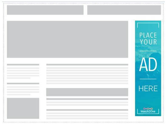
Where is the Wide Skyscraper used?
The Wide Skyscraper is usually used along sidebars on websites and converts well both as text ads and image ads.
Example of a Wide Skyscraper ad
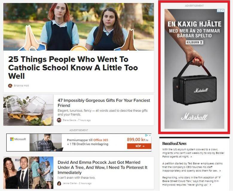
Buzzfeed’s entire business is ad-based and they have perfected the use of display ads in strategic locations. You can find a Wide Skyscraper on the right side of their main page.
As mobile has overtaken desktop as the main device for browsing the Skyscraper is becoming less and less relevant. I still recommend having one in your inventory for desktop and tablet devices, but if you have limited resources for creating banners your focus could be better spent on other formats.